How To Decorate A Nightstand

Decorating or accessorizing a nightstand is easy when you remember to use the rule of 3's. Using the rule of 3's helps to keep the area uncluttered and organized. 

The rule of 3's is using 3 objects per table. Sometimes you can group similar objects such as books or picture frames and count that as one object. This can be done if the size of your side table allows.


Additionally, adding an appropriate size tray will help to group things together and your table organized.

Randon Tip: If the table is large enough, you can go from three (3) objects to four (4) objects. Anymore than this would be too much.

Here are some examples of well decorated bedside tables.

1. Lighting 2. Plant 3. Group of Photos 4. Stack of Boxes (Random Object)
 
1. Lighting 2. Plant 3. Group of Photos
1.Lighting 2. Group of Photos 3. Tray of Objects (Random Object) 4. Vase (Random Object)


Follow these rules and you should have a well decorated side table each and every time. Good luck!
Simple Guide To Identifying Lamp Shades


9 Things To Consider Before Decorating A Room

Sometimes decorating can seem hectic when you aren’t sure where to start. It can also become frustrating when you aren’t sure you’ve done everything. Meaning, at times it can feel as though you’ve left something out, or maybe the room appears incomplete. Here is a list of thing to consider before decorating a room to help ease the decorating process.


1. Determine your style. What look are you going for? Is it contemporary? Modern? Hollywood Regency? Eclectic? Knowing what style you are going for beforehand will help make furniture shopping much easier.


2. Determine the functionality of the room. Meaning, what would you like the room to be used for? Is it a living room for entertaining but also for working? A bedroom with an office space and a sitting area? Knowing how you want the space to function will help you to consider the types of furniture you are going to need to purchase.


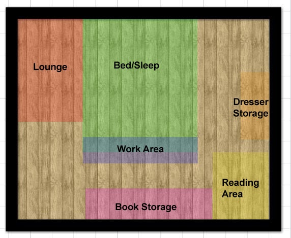
3. Once you have determined how you want the space to function, determine how you are going to section off the room. The room could have 2, 3 or even 4 different sections. It all depends on how you would like to use the space.


4. Identify the focal wall.  In a bedroom it is typically the wall in which your bed will be against. In a living room it would be the wall in which this is a fire place or where the television would be.

The focal wall in this space is the wall with the bed.


5. Once you have determined the focal wall and sectioned off the space, determine the layout of the furniture. This will be your floor plan.


6. Determine the color scheme. Will it be a monochromatic white room? Black and gold. White with pops of color? It’s all up to you. If you aren't sure of yourself you can always find inspirations from other rooms in which color scheme you love and use the Sherwin-Williams Chip it program at www.letschipit.com. Probably one of the greatest paint tool I've seen. Very innovative and takes away the guess work in color matching.

Here is an example of the Chip It tool used to color match this room's palette.


7. Identify the windows in the room and determine how you will dress them.


8. Decorate each section as though it were its own attraction. For example: Let’s say you have a sitting area in the bedroom, focus on making that section just as important as the main bed section. Decorate it as though it were its own attraction. 
  
9. Never forget overhead lighting. Lighting can make a huge impact in a room although it's often forgotten.

Once you have marked these off your check list, the designing clutter should be all swept out and organized. Good luck!

Quick Designing Tip


Corner windows are two windows that are set very close to the corner of a room. Hanging drapes on them can be tricky as they rarely allow space for drapes on the sides closest to the corner.


Observe how tight the space is in this 3D model.

But there is an easy solution to this. Instead of trying to hang two separate pairs of drapes on both windows, it is best to use 3 sections of drapery to make the two windows appear as one large, connected window.

To do this you will need what is called a curtain rod corner connector. This will allow your drapes to have a continuous flow from one wall to the other. It will also give the illusion that your windows are one continuous piece.

Curtain rod corner connector and assembly pieces.
Once you have installed this piece as the connector of two curtain rods, you simply hang drapery down the middle of the corner, covering the wall completely for a nice flow. 


And there's your quick tip to tricky design solutions. Good luck!

1. Paint Your Doors Black And Upgrade The Hardware.


Black doors can give any space an instant luxury feel because the color black exudes sophistication and class. Couple this with better hardware (getting rid of the standard knobs), and you have a stylish door. It's up to you what kind of black you want to use, whether blue-black, gray-black, green-black, or black-black. There are also different finishes depending on your taste and what type of look you've going for. A high gloss black will look more glamorous while a matte black will appear more rustic.

Choose a high gloss finish for a glamorous look.
A semi-gloss finish can go in any space.
Matte finishes are great for a rustic look.

2. Use Large Throw Pillows

Using throw pillows that are less than 20x20 will always appear inexpensive. In addition, filling a pillow with larger inserts will give the pillows a more high end look. For instance:


3. Molding and Panels

Adding these make for great architectural interest. Sometimes a space can look bland no matter how nicely decorated. There tends to be that feeling that something is missing. When you want to add real interest to a space try adding molding or paneling. It's fairly easy to install yourself and the payoff far outweighs the effort.

via ApartmentTherapy
 
Also note the extra large pillows :-)

4. Floor To Ceiling Drapes

I can't stress enough how important it is to consider hanging drapes as close to the ceiling as possible. The floor to ceiling drapes elongates the appearance of the walls therefore making the ceiling appear taller.

Notice how the drapes start far above the window and travel far down to the floor.
 

5. Oversize Mirrors and Art

This is probably one of my favorite things to do. It's one of those things that I believe if you're going to do, then you better go big or go home. COMMIT! It does wonders to a space especially when placed above a console, buffet or spanning the length of a wall. Check out these examples:


6. Tall Table Lamps

Please do not be a victim to small table lamps. With very few exceptions, I cease to understand their existence. Lamps aren't simply for lighting anymore, these days they have also become a work of art. Large table lamps, whether on a console or nightstand, give off great presence like Roman statues or Grecian columns. They should be allowed to stand bold and tall.


7. Grasscloth Wallpaper

While this is more of a personal preference (it's either your taste or not), you can't deny the luxurious feel it adds to a room. It almost transforms a space into a five start hotel. The texture, richness and warmth it brings into a design is hard to ignore. Though it is a bit difficult to install on your own (it's not as simple as putting up a regular wallpaper), the payoff is equally worth the effort!


8. Hardwood Floors

This goes without saying. Carpet can really cheapen a design while hardwood floors tend to elevate the overall look of a space. It brings sophistication, class and richness into any home. With it everything seems to comes together nicely.


Take your time when making decisions about decorating. Much of these tips are basic decorating 101 and easy to achieve. With these tips you can easily upgrade the look of your space with very little effort. Hope it helps, and good luck!
Here are some easy guides to helping determine which area rug size would be appropriate for both twin and queen size beds. 

When purchasing area rugs for a bedroom you want to bring into account whether you want the rug to accommodate both the bed and side tables or just the bed alone. This will help you to determine how large or small your rug needs to be. Measuring the space that you want covered beforehand can also help you to determine which size would be most appropriate.


Understanding the options you have when placing down an area rug makes it easier to determine which size would best suit your space.

Tip: So as long as your feet touches the rugs on both sides while stepping out of bed, the size is good enough. 2'-3' on either side should suffice.
Inspired by Lisa Ferguson of DecorMentor

A Simple Guide

Optimal: All furniture in the space fits within the area rug.

Good: At least the front legs of the furniture fits onto the rug.

Poor: None or very little of the furniture fits onto the rug.


Some people are really into color, but decorating with color can seem daunting when you aren't sure which colors would look nice with what. The choices at times can seem endless. But there is an easy trick you can use when deciding with color, any color. Whether it be paint, pillows, drapes or carpet, this method will work on any of them.

The best place to look when trying to pair colors is a color wheel. A color wheel makes it easy to identify complementary and analogous colors.


Complementary colors, also known as contrasting colors, are colors that are opposite one another on the color wheel/spectrum. When combined together these colors produce white light, which is why they are considered complementary.

The complementary colors on the color wheel are blue and orange, red and green,  and yellow and violet. Complementary colors tend to make a space appear more dramatic. It's a great way to add drama to a room.

Below are examples of a rooms decorated using complementary colors. Notice how in the first image blue and gold (a color very close to orange) are used to complement one another.


The next image uses blue and orange as pops of color in their design.


Analogous colors, also known as harmonious colors, are groups of colors that sit adjacent to one another on the color wheel. One is usually dominant, and they are either primary or secondary colors. 


Using colors next to one another on the color wheel keeps the space harmonious because the colors are very similar. So pairing blue and green, or red and orange, violet and blue or green and yellow is a great way to layer color.

In the example below, a color from the blue family and a color from the green family are used to create a harmonious space.


The next example shows bedding of colors from the blue family and colors from the green family. 


When trying to decide what would go with what, ask yourself if you're looking for something dramatic or if you're trying to achieve something more harmonious. Just remember, complementary exudes drama, while analogous tends to be harmonious.

Good luck!

Why do some people choose a monochromatic design?
  • Fear of color
  • Unsure of how to coordinate colors
  • Easy to redecorate 
  • Likes the look of it
Here are some examples of monochromatic rooms.


While a monochromatic space may feel calming and cohesive, it can also end up looking pretty bland due to the lack of variation in color. The best way to avoid this is by playing with texture and pattern. Whether it be in the textiles, wall (paint, wallpaper or architectural detail) or the furniture itself, the mixing and matching of texture and pattern brings a lot of interest and dimension to a monochromatic room.

Here are examples of the different types of texture and patterns you can include in your design.


Below is an example of a monochromatic room using various textures and patterns to add interest back into the space.


Fur, cable knit, sequin, velvet and various shades of the same color are used in this space.
This living room has a mixture of leather, fur, satin and velvet while still sticking to the same color palette.


Here we have a cable kit and fur throw, print pillows, and pillows of varying shades of the same hue.

This space uses a blueish gray and accessorizes with fur, print and cable knit throws.
Once you've become comfortable with the mixing and matching of different textures and patterns, you will soon find yourself including it in non-monochromatic spaces as well. Give it a try. Good luck!